The adverts on smartphones keep profitable. There are some tips for mobile banner ad design and the difference of banner sizes.
Banner advertising network is one of great sources to get profit in affiliate marketing. The adverts on smartphones keep profitable. There are some tips for mobile banner ad design and the difference of banner sizes.
▶ In-App Banners
▶ In-App Native Ads
▶ Elements of a perfect banner
▶ Summary
In this article we will discuss ads for smartphones, or to say it more clearly, we will talk about the best mobile banner ads design and the sizes of your creatives. You’ll find what types of banners we have and how to make your mobile ads stand out from the crowd. Get high-quality mobile in-app traffic in our mobile banner advertising network.
Why does mobile ads banner keep profitable?
The number of mobile users will soon surpass 15 billion. The Internet is becoming more accessible and faster. Downloading a movie in 1 minute no longer seems like something beyond reality. The consumption of mobile content in the world is growing steadily. The demand for advertising for smartphones increases along with mobile traffic.
Mobile traffic banners (including banners in apps) may be a great option for a successful ad campaign. However, the tricky part is getting users' attention to your ad. Users are overwhelmed with online ads, so advertisers should come up with different tricks to get users’ clicks. To increase revenue generation, advertisers should use different ad creatives, ad spots and optimize campaigns through targeting options.
Mobile ad banners have been keeping popular as a traditional and profitable format, though a few affiliate advertisers consider banner format as old-fashioned one, but we can’t relate to it at all! They say, users have learned the locations of banners and prefer to ignore them. Surely there is such a term as “banner blindness” to describe such behavior of the target audience. We can agree users get used to ads, though there are reasons for that. We can split the indifferent attitude into two main mistakes.
The first one is wrong targeting. If you do not understand the specifics of your potential customers and the product, then you can say goodbye to good results of any advertisement type, not banners only. That’s why we do our best to gather as much experience of ours to help you stay profitable with ClickAdilla. You can check our articles to learn more useful tips for your advertising campaigns, including the recommendations for your target audience.
The second reason is more wide. Your potential customers can ignore your adverts because of boring and trivial creatives. They see similar creatives with each opening websites, so it is obvious they prefer not to focus on advertisement. There are some practices to make your ads creatives differ from other ones, so we will talk about these recommendations as well.
In-App Banners
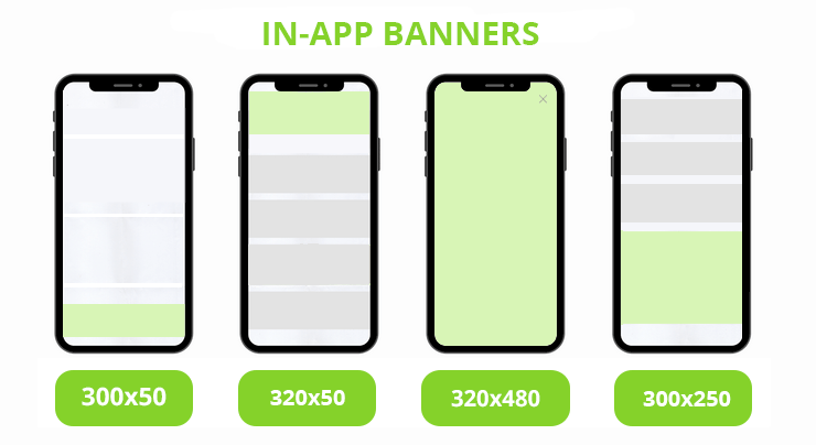
Banner advertising remains one of the most widely used ad formats. Banners come in a variety of sizes, static, dynamic, and even interactive. Let’s take a look at the best mobile banner ads sizes that you can use for advertising in our ad network.
Mobile Banner 300x50
It’s the smallest ad size in our inventory. To get the most out of a 300×50, make sure you have a concise message to convey and simple, clear graphics. This way, you can get your message across in a tiny space.
Large Mobile Banner 300x250
This banner size is significantly larger than the previous one. It takes up almost half of the screen. It is also located among the content, but more visible.
Mobile Leaderboard 320x50 (728x90 for tablets)
It is the big brother of the Mobile banner. The leaderboard is slightly bigger and visible, and fits well with seasonal ad campaigns with sales and special propositions. Mobile Leaderboard is universal, cost-efficient, and flexible. According to Google, this is one of the TOP performing Mobile banners.
Mobile Interstitial 320x480
It’s the largest ad size among in-app banners. Mobile interstitials are full-screen overlays. This ad format was designed to fight “banner blindness”. Users will definitely notice it, since it covers the screen of the app.
Mobile In-App Banner 728x90
The size is the same as the mobile screen, so it covers the whole visible part. So this one can make your ads more noticeable. Interstitials allow for more context, clearer call-to-action, and more creative content. This allows you to encourage more engagement, hence lifting your brand performance and recall.
Often, Interstitial ads appear between game levels or during loading. The user can close it immediately. Then the user returns to the main content again. So this way, users' experience is not interrupted at the most unexpected moment.
In-App Native Ads
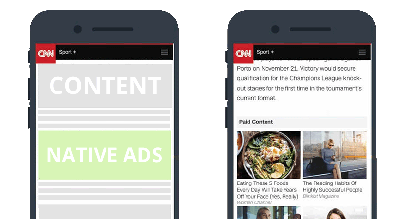
Native ads are ad units that integrate seamlessly with website content. According to statistics, Native ads generate 53% more views than banners. Native advertising is perceived by users as site content. However, it is necessary to create really valuable and useful content so that the ad does not annoy users.
In-app banner advertising is a versatile marketing channel and fit for all app types:
- Mobile games;
- E-commerce;
- Sweepstakes;
- Lifestyle (Fitness, Dating, Travel);
- Utility Mobile Apps (VPN, Antiviruses, Cleaners);
- Online casino, sports betting, and others.
Elements of a perfect banner
There’s no perfect recipe for a successful banner ad, but we bring some general practices which are essential.
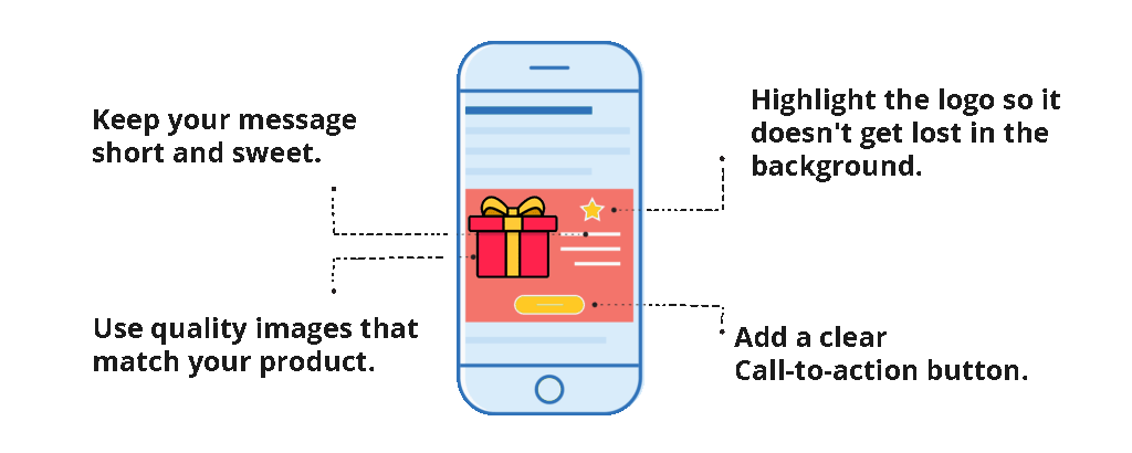
Keep it short. Show to the user the benefits of clicking on the message. These are some examples: “Limited Time Offer”, “Grab your limited promo code” or “Exclusive Deal”. The key is to show your potential customers the main profit which they can get from clicking on your mobile ad banner.
The best mobile banner ads design should not be too detailed as well. Just imagine plenty of visual details on the small screen of mobile devices. Better give your preference to minimalistic examples, like using a logo and one main visual object. Such mobile ads banner can get more attention, because it doesn’t seem blurry.
The next tip arising from the one above is keeping short texts. In the first recommendation we meant to use Call-to-Action phrases. So now we talk about short and accurate descriptions for products of your advertising campaigns. Mobile banner ad sizes do not allow you to write long texts, or to make it clearer, the sizes are too limited to write large texts down harmoniously. Plenty of letters would make your banner blurry as well.
Use quality images that match your product. The best performance shows pictures that convey emotions. Try to use less images from photostocks. Natural and alive pictures can attract more attention of your target audience, whereas your potential customers can ignore the photos with photoshop.
Do you want to increase your brand awareness? Highlight the logo, so it doesn’t get lost in the background. If the main task of yours is to make the product more recognizable, then you can make a logo the major visual detail of your mobile ad.
Users are tired of advertisements, so they may ignore banners after a quick glance. Try to use animated images to avoid it. But do not overdo it with animated mobile banner ad design. There are some examples which you shouldn’t use: blinking and fast-changing ones. It’s better to avoid hard contrast and high brightness as well. Yeah, such animation can attract the attention, though users can take it negatively.
There is one more recommendation for mobile ad banners of video format. Video banners have been gaining more and more popularity, but there are some specifics which you shouldn’t neglect. Before choosing video creatives, draw the attention to loading speed and screen sizes. Mobile banner ad sizes should not cover screens fully (the exception is a user decides to click on it for expanding). Pay attention to the sound of your advertising as well. Make the settings for turning the sound off, we mean the sound shouldn’t be turned on automatically. If your potential customers will be interested in listening to your adverts, then they turn it on themselves. But unexpected sounds can be annoying.
Add a clear Call-To-Action button, for example: “Click to Win”, “Install for free”, “Add to Cart”, “Sign Up”, “Get it now” etc.
After your ad creative is ready - try to see it from the outside. Would you click on this banner? And, of course, one ad creative is not enough if you want to get good results. To find the best one, you need to test at least 3 examples of banners. It can help you to analyze and find possible mistakes to create effective ads banner for mobile devices.
Summary
Ads in mobile apps will be equally effective for apps filled with users with impressive daily session lengths and those that are used only occasionally if the size, format and placement of the mobile ad unit is chosen wisely.
However, choosing a mobile ad format is only part of the in app campaign performance equation. Much will depend on your targeting settings, the right ad platform, banner advertising network, and other important factors.
Call-to-action: Want to improve your performance and scale advertising campaigns effectively? Get mobile traffic in ClickAdilla! Reach out to your account managers to get assistance with fine-tuning a campaign.

