Thinking of more conversions in affiliate marketing? - Boost your banner campaign! We prepared a checklist that the majority of advertisers tend to forget while creating a banner campaign!
Quick navigation ⤵️
▶ Remember the sizes
▶ Optimize for all devices
▶ Use animation
▶ Choose the Colors
▶ Select the Language
Banner advertisements may be both, vertical and horizontal; for mobile devices and for PCs. It is a very effective tool on any part of the buying journey: you may use it to monetize your website’s traffic or reach new potential audiences.
? THINGS YOU BETTER KEEP IN MIND:
Remember the sizes
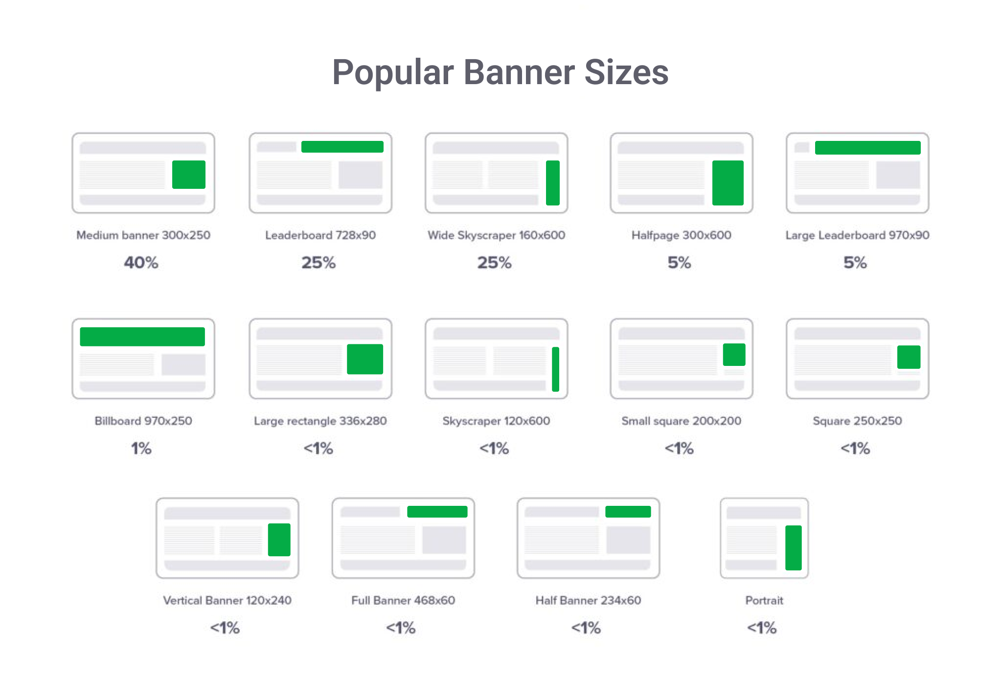
At any vertical there are some common sizes performing better than others, so keep in mind that:
The Mainstream industry banner dimensions - 320 x 50 px, 300 x 250 px, and 320 x 480 px.
Adult - 300 x 250 px and 300 x 100 px.

Optimize for all devices
? First of all you don’t wanna have a heavy banner as it slows down loading speed and the user experience - try to make sure the size is lower than 800 kb.
Despite the vertical you are working in and services you advertise, your banner should load and fit the screen of any device (be it a mobile phone or a PC). There are also recommended formats to use while uploading your creatives, namely JPG, PNG, GIF, and HTML5. As for others, you cannot be sure that your potential customer has a required third party software installed on the device to load different types of ads. However, this gives you more opportunities to use cross-targeting to follow people who already saw your ads on other devices they may use.
Use animation

It is not a secret that animated ads attract more attention rather than static ones. Meanwhile, do not get in too deep, keep in mind that the message should still be simple and easy to perceive. The optimal animation duration time is up to 15 seconds. If it is looped - CALL TO ACTION in the last frame.
Choose the Colors
Ads are always about emotions. Different services may be associated with different colors. As these associations are mostly cultural, make sure you understand your target audience.
Select the Language
Depending on the language you use in your ads, It may differently impact the strength and effectiveness of your campaign.
Depending on the GEOs you work with, the topic and language are more or less important.
Your language usage is always the main and first thing to pay attention to.
? The reason why some Media buyers may get virtually no clicks from their campaigns is the language being chosen wrong.
If your ad campaign showcased English words, while being run in Spanish-speaking countries - do not wait much from it.
Misspelling is definitely a problem as well, so make sure you translate your creatives correctly, otherwise, that will literally make no sense.
? Same for marketers: you may have a wonderful creative with a perfect service that will get no single click while it is promoted for South Africa in Spanish – no chances.
Affiliate marketing is adapting the language to each specific audience.
? Same for webmasters:
A website for a Latin American audience with info about European football clubs written in English will have no success among your audience - they will not be even able to read your content.
? You see banner ads every time you search the web, which means this ad format is still effective. Advertising with ClickAdilla makes the creation of your campaigns quick and easy. You may track all key metrics to improve your company’s revenue. You may also find all types and sizes of banners at ClickAdilla and effectively use them at any vertical. Try them now!

![[Case Study: +39% ROI] How I ran $200 on Japan Dating In-Page from scratch and with zero KYC. Inside settings from Clickadilla's Head of Accounts.](/_ipx/f_webp&s_280x160/storage/blog_twitter_linkedin_15f9453250/blog_twitter_linkedin_15f9453250.png)


