In-Page Push becomes more and more popular, so today we will talk about a new feature which will help your Ad campaign generate more conversions - High Quality In-Page!
In-Page Push becomes more and more popular, so today we will talk about a new feature which will help your Ad campaign generate more conversions - High Quality In-Page!
Quick navigation ⤵️
▶ In-Page Ad Format
▶ Features and advantages
▶ Difference among Verticals
▶ High Quality In-Page
▶ HQ Top verticals
▶ Top GEOs
▶ What do you need to start?
In-Page Ad Format
Just to refresh your memory here are couple moments that characterize In-Page Notifications best:
a display type of ad (technically - a pop-up banner). It is also called Social Bar.
does not require permission to subscribe and allows you to reach a larger audience than by using classic web push.
the notification appears in the upper or lower right corner of the site so it looks rather native.
the appearance of the notification is similar to classic web pushes, but it may differ depending on the vertical, device, OS type.
We released an article couple months ago where we discussed advantages and disadvantages of this format and compared it to Web Push ?
Features and advantages
In-page push is an interactive ad format that really catches the attention of the audience. It’s appearance is very similar to system notifications of messengers and devices. Moreover, the notifications may be shown on all devices and OS types. You may use Emoji, GIFs and short mp4 videos in your creatives to make them even more catchy. Additionally, since it is not a subscription format - the users are always fresh and notifications are shown while they are surfing a website.
Difference among Verticals
In-page notification’s appearance can adapt to verticals, devices and OS types! Here are top verticals, among which notifications may vary:
1. iOS utility
2. Dating
3. Casual
4. Android utility
We prepared most common and converting creatives as an example for each vertical you may be interested in:
Dating:

Utility:

Casual:
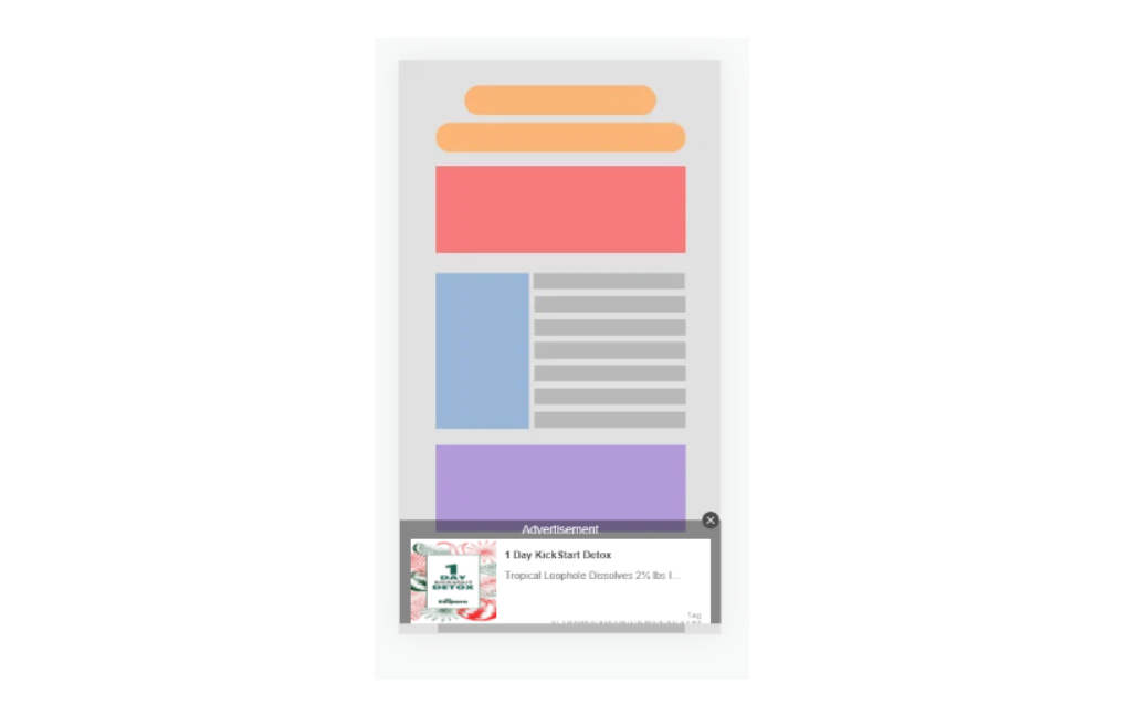
Betting/gambling:

High Quality In-Page
ClickAdilla has two types of In-page Ad format:
HQ - High Quality:

Maximally targeted clicks
The click zone is highlighted green
The close button is easily clickable
MQ - Middle Quality:

Wider click zone
The close button hardly clickable
To specify: HQ In-Page ads have smaller click zone which minimizes the possibility of misclicks and relatively results in higher traffic quality.
? For customized Dating notifications both HQ and MQ types are applicable.
The difference is in the size of the closing area.
As an example:
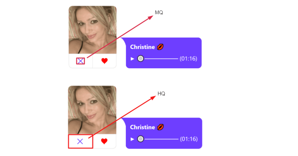
? For Utility notifications HQ notifications work better. Forwarding to the offer/landing occurs when a user clicks the “Open” button only.

HQ Top verticals
To help you cope with this new ad format better and easier, we prepared TOP verticals where your HQ In-Page campaigns will work best:
Dating + Adult ❤️
Utility ⚙️
Sweepstakes ?
Nutra ?
Betting/Gambling/Casino ?
Crypto/Forex ?
Top GEOs
Based on the amount of clicks we receive we identified TOP GEOs for different In-Page types of quality:
Middle Quality Top GEOs
India - 36.96%
Indonesia - 12.42%
USA - 12.17%
Japan - 8.98%
Russia - 7.72%
Germany - 5.35%
Brazil - 4.59%
France - 4.06%
Italy - 3.94%
China - 3.83%
High Quality Top GEOs
India - 24.71%
Russia - 16.75%
USA - 15.17%
China - 9.29%
Indonesia - 7.79%
Japan - 6.09%
Germany - 6.05%
Vietnam - 6%
Ukraine - 4.16%
Italy - 3.99%
What do you need to start?
Congratulations! You do not need anything since we have an auto generation function, which will generate your In-Page Ad for you based on your web site! Find more information about auto generation here ?
However, if you still want to create your In-page Ad by yourself, here is what you need:
Creatives:
1. Picture + Icon (You may also use GIF or MP4 for your creatives)
2. Catchy header + description (be creative, insert relevant emoji)
3. Your URL
4. Pre Landing page (optional)
Now you are ready to receive conversions on your In-Page campaign!

